

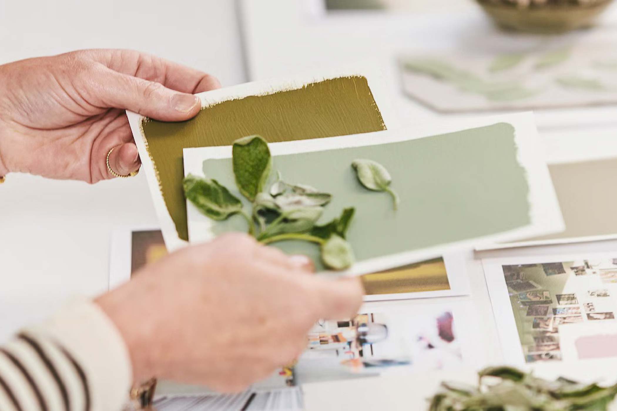
Image Credits: Dulux
Every year, paint manufacturers and colour authorities announce their Colour of the Year, and every year, the design community responds with a mixture of excitement, curiosity and the occasional raised eyebrow.
Some colours make bold statements. Others are deliberately provocative. And then there are colours that seem almost too ordinary to deserve the attention they receive.
For 2027, Dulux has selected Soulful Sage™, a soft, silvery green that feels rather unassuming at first glance. It isn't particularly dramatic, nor does it demand attention. In fact, some might argue that sage green has been around for so long that calling it a trend seems rather peculiar.
But perhaps that's precisely what makes this selection interesting.
As an interior designer, I've always maintained that colour should never be judged in isolation. Its relationship with light, materials, proportions and, most importantly, the people occupying a space determines whether it works.
And in the case of Soulful Sage, I think there's a much more interesting conversation to be had beyond whether green is fashionable in 2027.
It's about our psychological relationship with the spaces we inhabit, and why we might be gravitating towards colours that ask less of us.
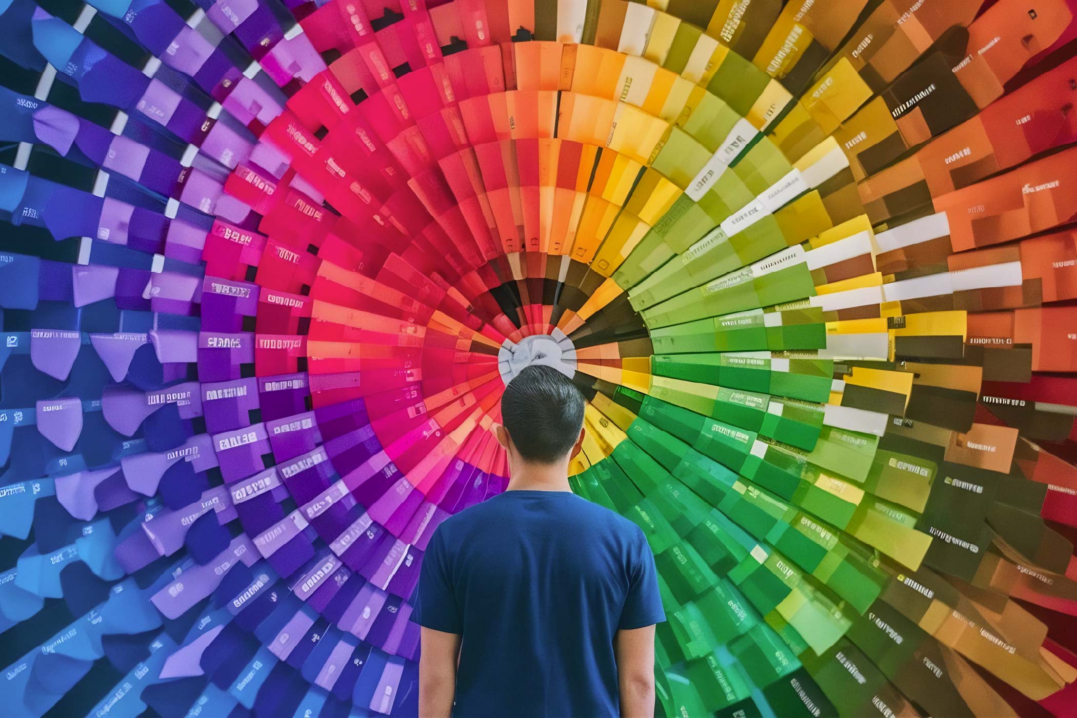
The Psychology of Sage Green: Why We Associate Green with Calm
Colour psychology is a fascinating subject, although it is frequently oversimplified in interior design discussions. We're often told that blue is calming, red is stimulating, yellow is cheerful and green represents balance.
But human responses to colour are rarely so straightforward.
Our perceptions are influenced by culture, personal experiences, lighting conditions and the context in which colours appear. A dark forest green can feel luxurious and sophisticated in one setting, yet heavy and oppressive in another. A bright lime green might feel refreshing in a children's playroom but distracting in a bedroom.
Sage green occupies an interesting position within this spectrum.
Sage themed mood board example
Unlike saturated greens, which can be visually assertive, sage green carries a muted, greyish undertone. This reduces its visual intensity and gives it an almost neutral quality. It introduces colour without overwhelming the surrounding environment.
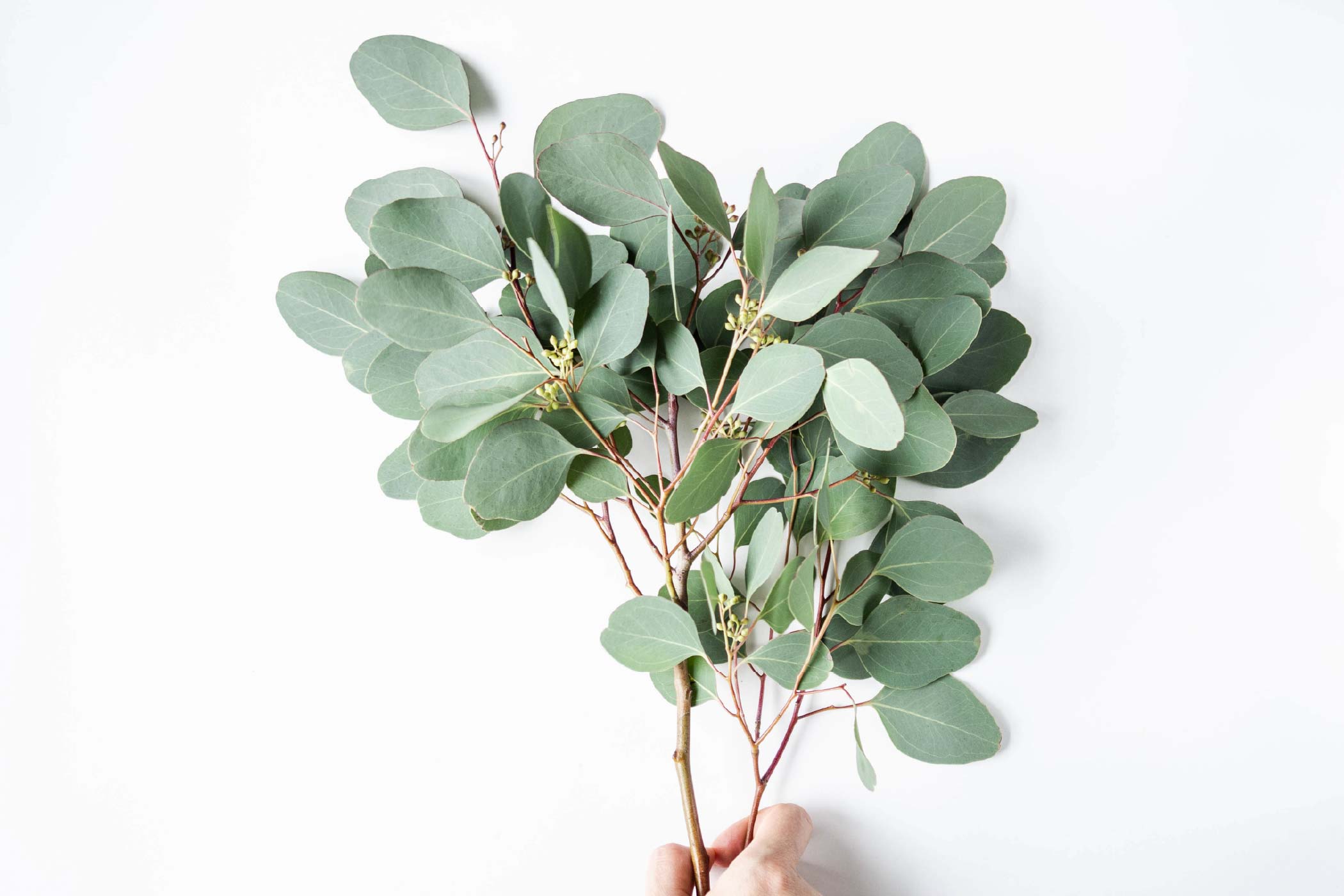
There's also the association with nature. Green reminds us of vegetation, landscapes and living things. These associations may contribute to feelings of comfort and restoration, particularly when a space incorporates natural light, organic textures and greenery.
This connects with the broader principles of biophilic design, which explores how incorporating elements of nature into built environments can support human well-being.
However, painting a room green doesn't automatically produce the psychological benefits of spending time in nature. The relationship is more complex, and evidence for specific paint colours producing predictable emotional outcomes remains limited.
What we can reasonably say is that a muted green can help establish a visually gentle environment, particularly when combined with thoughtful lighting and natural materials.
And that brings us to an important distinction.
A calming interior isn't necessarily one that contains calming colours. It's one that reduces unnecessary visual and sensory demands on its occupants.
A room filled with sage green walls, cluttered furniture, harsh downlights and excessive decorative elements can still feel uncomfortable.
Conversely, a well-composed interior using stronger colours can feel remarkably peaceful.
Colour contributes to the experience of a space, but it doesn't determine that experience on its own.
What Makes Dulux Soulful Sage Different from Other Greens?
One of the qualities I appreciate about Soulful Sage is its restraint.
In an industry where homeowners are constantly exposed to striking renders, dramatic feature walls and increasingly elaborate interior treatments, there's something refreshing about a colour that doesn't need to become the centre of attention.
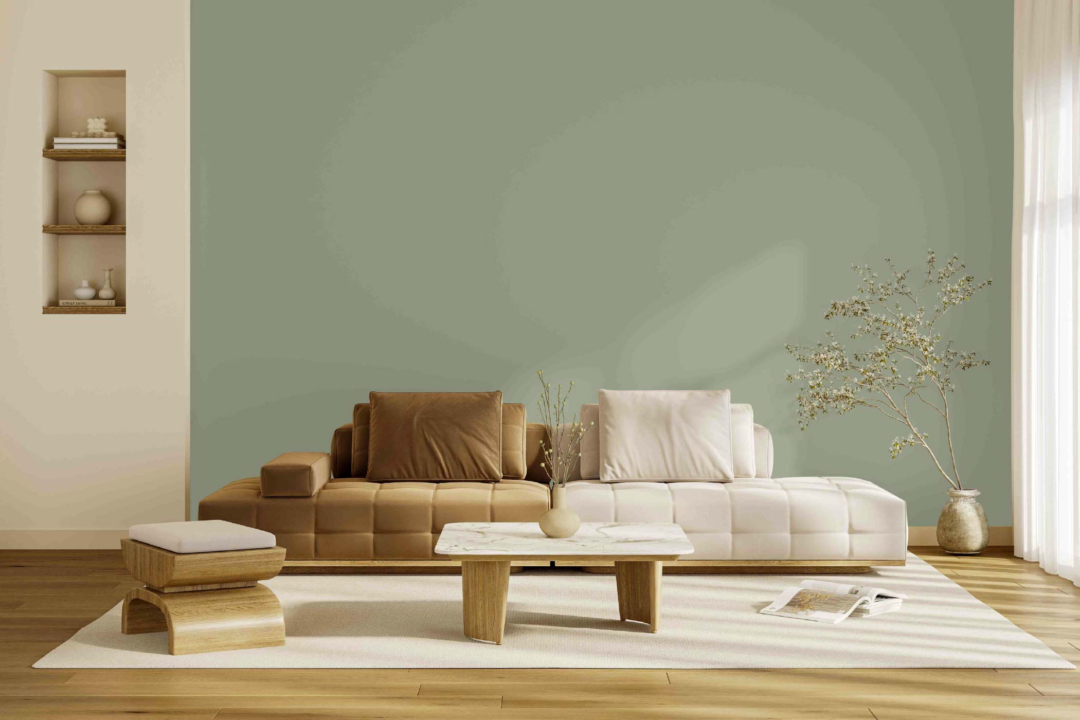
Soulful Sage sits comfortably between green and grey, with a soft, silvery character that allows it to respond subtly to changing lighting conditions.
Under cooler daylight, its grey undertones may become more pronounced, giving it a crisp, contemporary appearance. Under warmer artificial lighting, it can take on a softer, earthier character.
This adaptability is particularly valuable in residential interiors, where lighting conditions and activities change throughout the day.
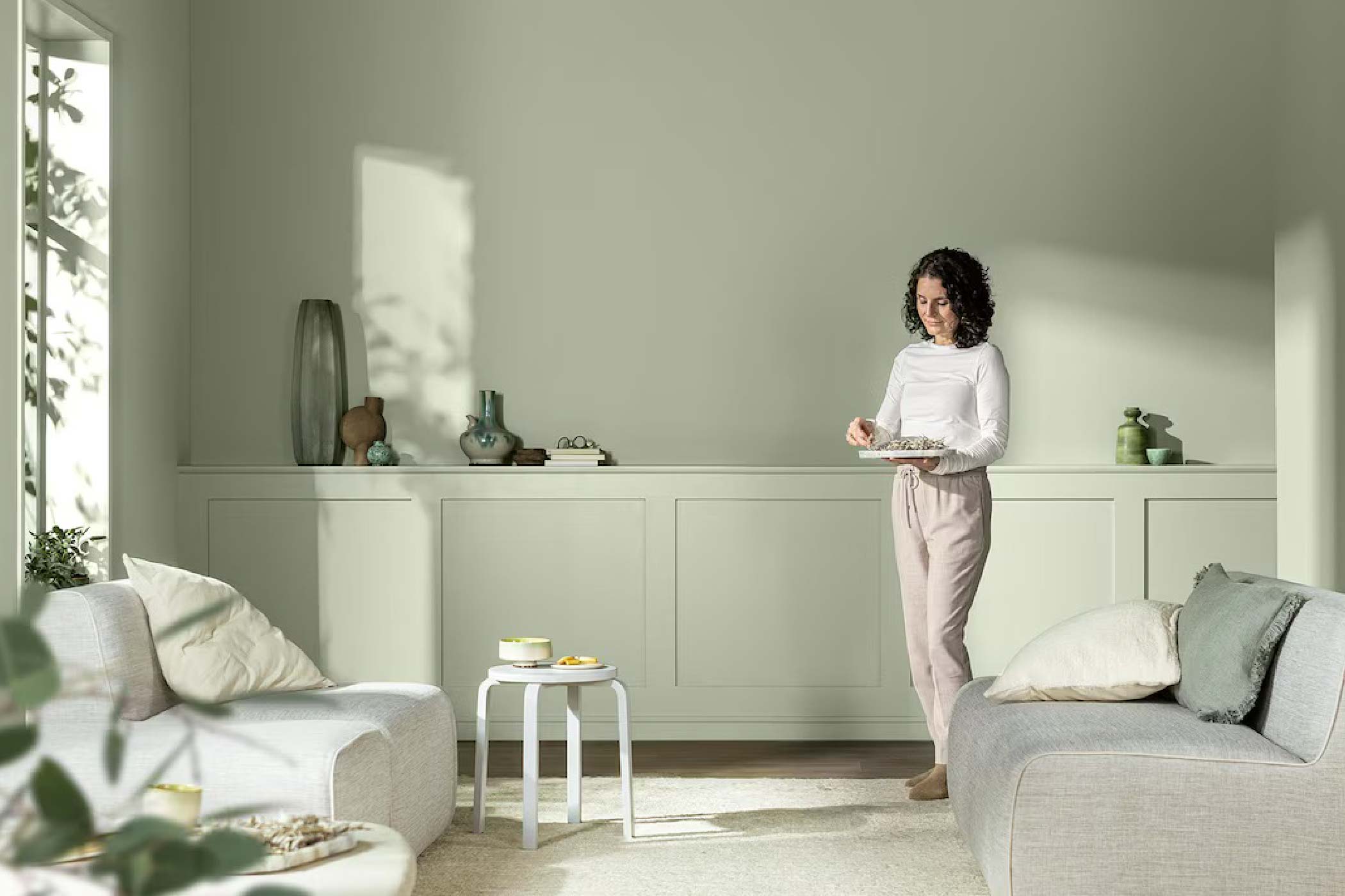
Image Credits: Dulux
Consider a living room. In the morning, it might serve as a bright family gathering space. In the afternoon, someone may be working at the dining table. By evening, it becomes a place for relaxation.
A colour that remains visually comfortable across these different circumstances offers considerable flexibility.
Another attractive quality is its compatibility with materials.
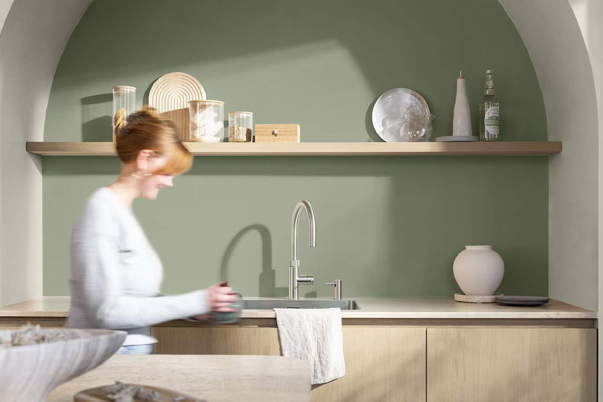
Image Credits: Dulux
Soulful Sage can sit beautifully alongside light oak, walnut, rattan, linen, natural stone and textured fabrics. It also works with warmer accents such as terracotta, muted pink, brass and earthy browns.
For homeowners who favour Japandi, Scandinavian, contemporary or modern-classic interiors, this makes it an accessible colour to introduce without dramatically changing the design language.
But here's where I would offer a word of caution:
Versatility should never be mistaken for universal suitability.
A colour that works beautifully in a sunlit showroom may behave very differently in a compact HDB bedroom with limited daylight. Its undertones can shift depending on the colour temperature of artificial lighting, the reflectance of adjacent surfaces and the materials surrounding it.
This is why designers shouldn't simply select colours from a catalogue and assume they'll behave as expected.
We need to understand how colours interact with the architectural environment, and sometimes, the most sophisticated use of a colour is knowing where not to use it.
How to Use Soulful Sage in Singapore HDB Flats and Condos
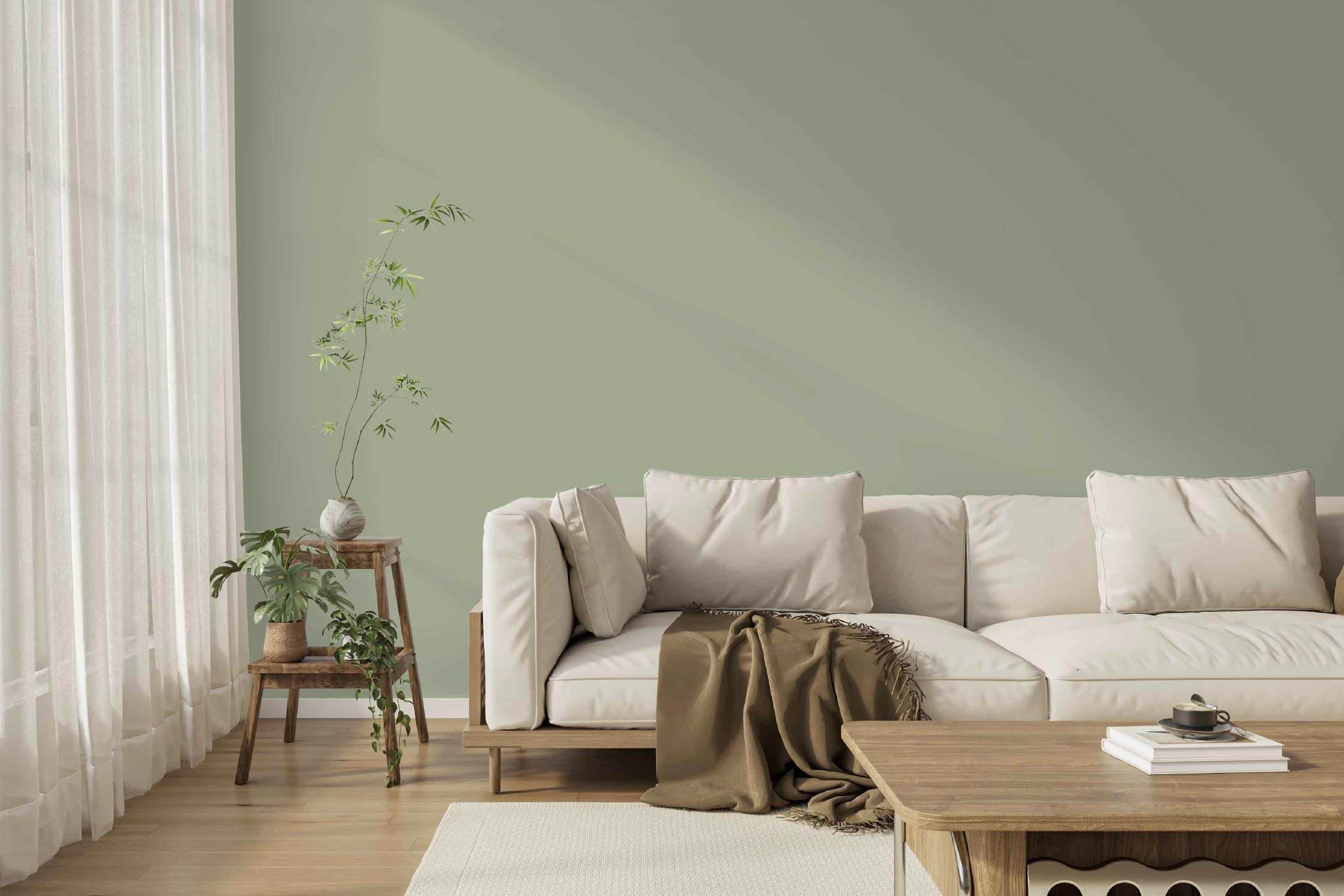
Singapore's residential environment presents some interesting opportunities for a colour like Soulful Sage.
Our homes are generally compact, increasingly multifunctional and exposed to strong tropical daylight, although actual indoor illumination varies considerably depending on building orientation, neighbouring blocks and window placement.
The challenge is therefore not simply choosing a beautiful colour, but deciding how much of it to introduce and where it should terminate.
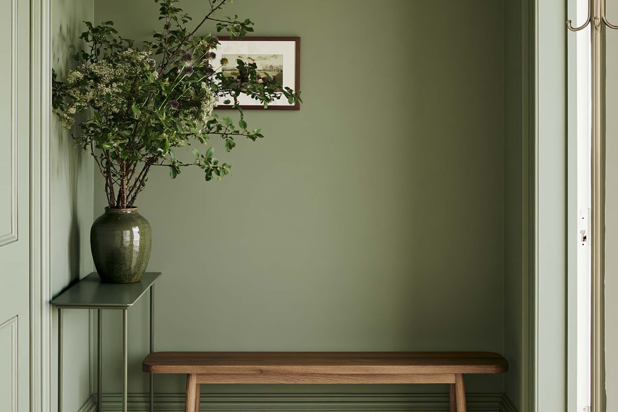
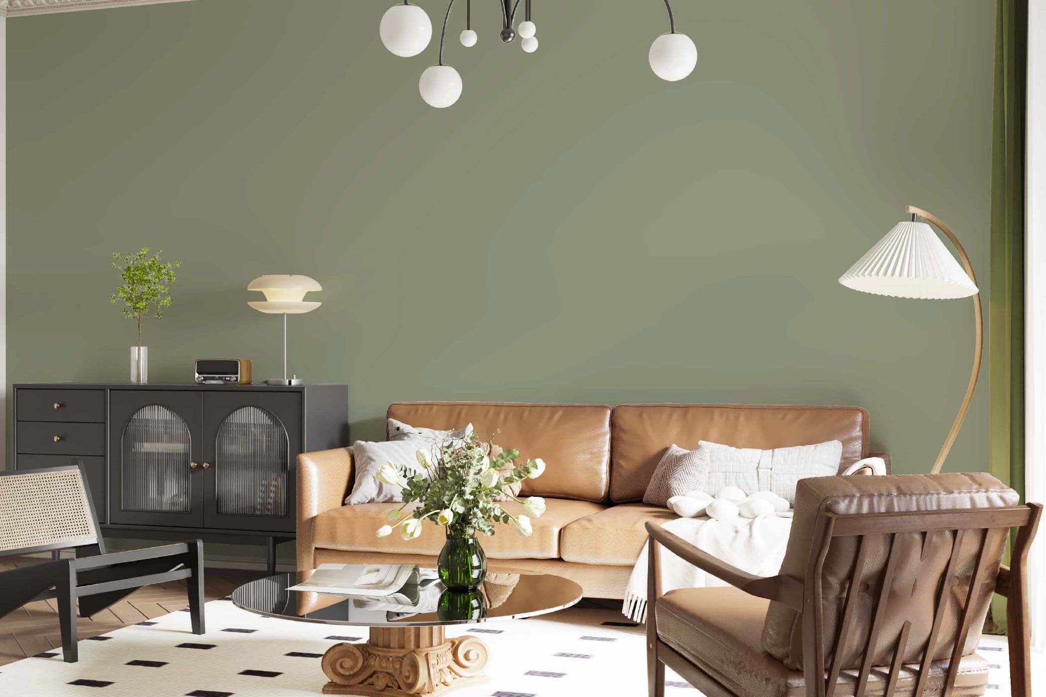
An example of “colour drenching” where the walls and including the ceiling is painted in the same colour.
Beyond the Feature Wall: Using Colour Drenching
The conventional approach would be to identify a feature wall and paint it green. There's nothing inherently wrong with this, but I think it misses an opportunity.
Rather than treating colour as a decorative surface treatment, consider how it can define architectural volumes.
Soulful Sage could extend across a wall, continue around a corner and terminate at a doorway or a change in ceiling height.
Alternatively, it could be applied across the walls and ceiling to create a cohesive, enveloping environment.
This approach, commonly referred to as colour drenching, can soften the perception of individual architectural boundaries.
For smaller living rooms, such an approach can sometimes make the space feel more unified, particularly when unnecessary visual contrasts are reduced.
However, colour drenching should be considered alongside natural illumination, furniture finishes and the desired atmosphere. Painting every surface the same colour doesn't automatically make a room appear larger.
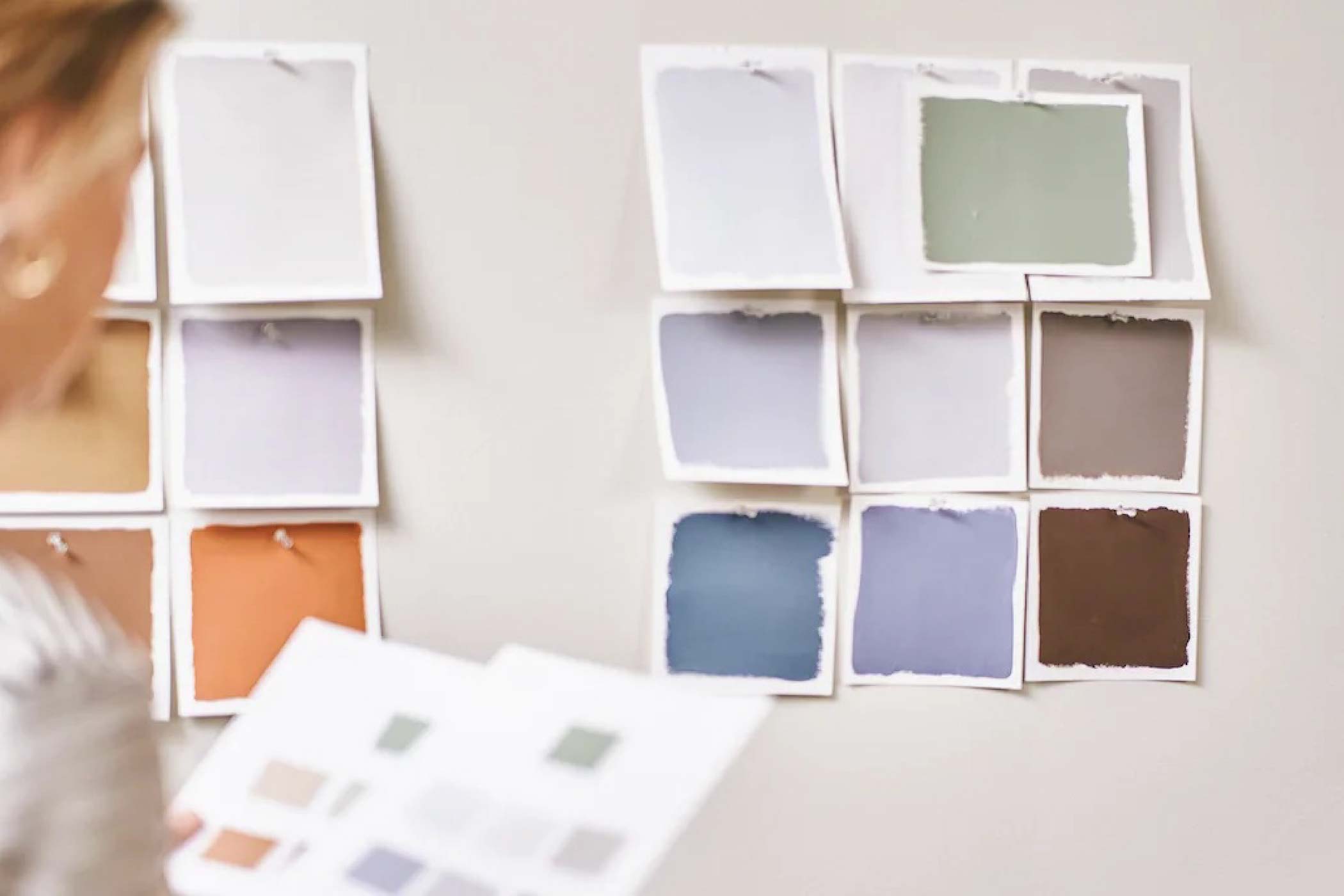
Image Credits: Dulux
Why Dulux chose Soulful Sage as its Colour of the Year 2027
According to Dulux Singapore, the selection of Soulful Sage emerged from its annual trend forecasting process, which brings together international design experts to examine broader social, cultural and lifestyle developments.
For 2027, one of the recurring themes was the emotional weight people experience from global uncertainty, constant information and the pressures of modern living.
Dulux's response was a concept it calls "Live Lightly", encouraging homeowners to create environments that feel lighter, more uplifting and less overwhelming.
Soulful Sage was selected because of its soft, silvery appearance, its associations with nature and its ability to work across different interior styles.
Rather than presenting a single prescribed aesthetic, Dulux has developed three complementary colour stories around it.
What I find interesting is that these palettes acknowledge something designers have understood for a long time: the same colour can produce very different experiences depending on what surrounds it.
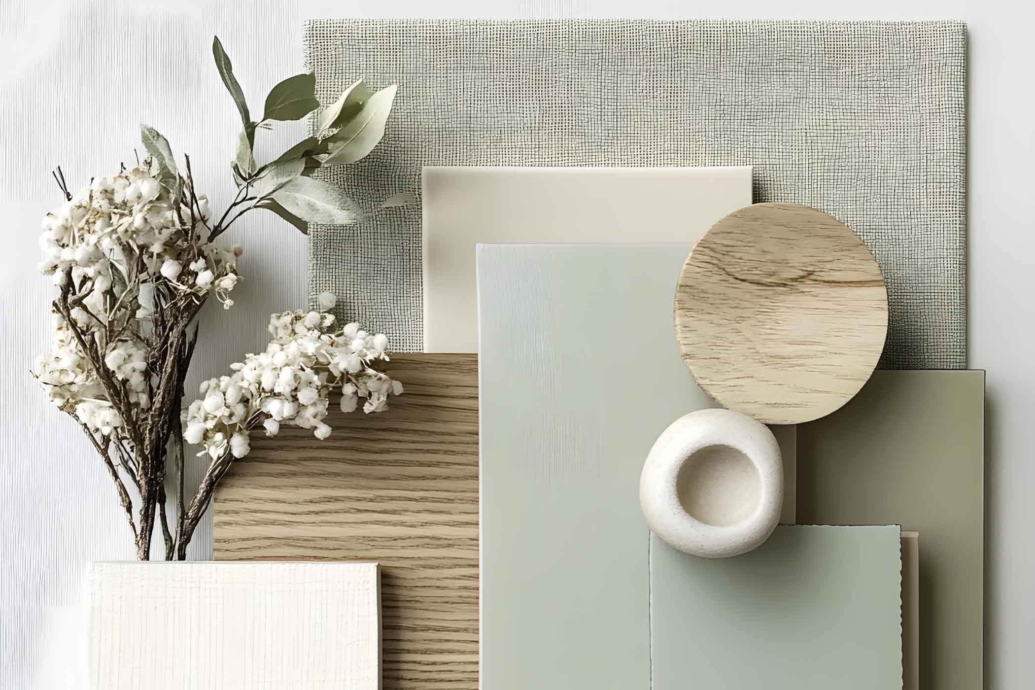
Sage themed mood board example
Soulful Sage paired with terracotta and warm timber can feel intimate and grounded. Combine it with pale neutrals and it becomes restrained and contemporary. Introduce playful pinks and ochres, and suddenly it takes on a more expressive personality.
The colour itself hasn't fundamentally changed.
Its context has, and perhaps this is the most valuable lesson homeowners can take away from Dulux's 2027 selection.
Colour is never a standalone design solution. It's part of a larger composition.
Are Singapore Homeowners Moving Away from Statement Interiors?
Looking at the broader direction of residential design, I think Soulful Sage also raises an interesting question about our changing relationship with our homes.
For much of the past decade, social media has played an increasingly influential role in shaping interior preferences.
Homes are photographed, filmed and shared. Dramatic visual elements attract attention, and design decisions can sometimes become driven by how well a space performs on a screen rather than how comfortably it supports everyday living.
We've seen feature walls become progressively more elaborate, lighting arrangements increasingly theatrical and material combinations more visually assertive.
None of these approaches is necessarily wrong, but I do wonder whether we're beginning to recognise the value of interiors that don't constantly demand our attention.
After all, our homes are not showrooms.
They're places where we eat, sleep, work, argue, celebrate, recover and spend some of the most ordinary yet meaningful moments of our lives.
Perhaps the appeal of Soulful Sage lies in its ability to step aside and allow those experiences to take precedence.
Rather than competing with the occupants, it provides a quiet backdrop for living. That, to me, is far more interesting than whether sage green happens to be fashionable this year.

The Designerd's Final Word: Should You Follow the Colour of the Year 2027?
There's a certain irony in writing an article about the Colour of the Year while advising homeowners not to follow colour trends blindly, but that's precisely the point.
Colour forecasts are valuable because they encourage us to reconsider familiar palettes, explore new combinations and understand the evolving relationship between design and society.
They are not instructions.
A well-designed home should remain relevant long after a particular colour has disappeared from trend reports.
If Soulful Sage resonates with your personality, complements your lifestyle and works with the architectural character of your home, then by all means embrace it. But if you prefer richer colours, darker interiors or more expressive combinations, there's absolutely no reason to abandon those preferences simply because a paint manufacturer has declared a new favourite.
Dulux's Soulful Sage may be the Colour of the Year for 2027, but its underlying message is arguably more enduring.
Perhaps the future of interior design isn't about creating homes that look more impressive.
Perhaps it's about creating homes that allow us to feel more at ease.
So, if a quiet shade of green helps us move in that direction, then I think it's a colour worth talking about.
Frequently Asked Questions About Dulux Soulful Sage
What is Dulux's Colour of the Year for 2027?
Dulux's Colour of the Year 2027 is Soulful Sage™, a soft, silvery green with muted grey undertones. Selected as part of Dulux's "Live Lightly" theme, the colour reflects a move towards interiors that feel calmer, lighter and more connected to nature.
Is sage green a good colour for HDB flats in Singapore?
Sage green can work well in Singapore HDB flats, particularly when paired with natural materials, light-coloured furniture and suitable lighting. However, its appearance can vary depending on daylight, room orientation and surrounding finishes. Testing paint samples before committing is recommended.
What colours go well with Dulux Soulful Sage?
Soulful Sage pairs well with warm whites, beige, light grey, terracotta, dusty pink and earthy browns. Natural wood finishes such as oak and walnut also complement its muted green tones, making it suitable for Japandi, Scandinavian and contemporary interiors.
Can sage green make a small room look bigger?
Sage green can help a room feel visually cohesive, especially when used consistently across walls or combined with similar-toned furnishings. Colour drenching may soften visual boundaries, but the effect depends on lighting, furniture and room proportions. Sage green does not automatically make a small room appear larger.
Will sage green go out of style after 2027?
Although Soulful Sage is Dulux's Colour of the Year 2027, sage green has been used in interiors long before this announcement. Its muted, nature-inspired character can work across various design styles. Homeowners should prioritise colours that suit their personal preferences and lifestyle rather than following trends alone.


